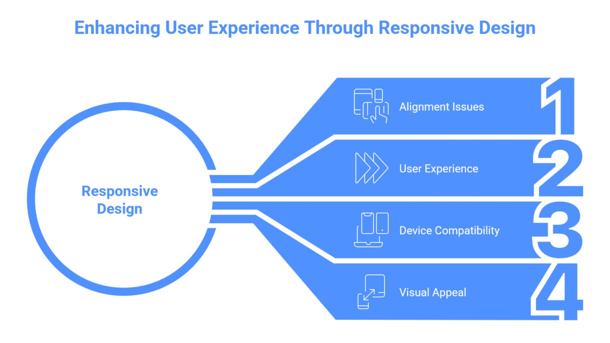
Have you ever changed your website’s desktop layout only to find it mismatched on mobile?
You are not alone; this is one of the most common grievances among Wix customers.
When you design in the desktop version, Wix will automatically try to modify the layout for mobile. However, it is not always perfect—texts overlap, buttons shift, and portions become misaligned.
This occurs because objects are positioned differently between views, particularly if you dragged them freely rather than utilizing hierarchical layouts.

Here’s how to fix it step by step:
– Use Strips and Columns: Always arrange information within strips or columns. They adapt better to different gadgets.
– Check the Mobile Editor. Go to the mobile view and manually move elements as needed. Avoid “dragging” out of the layout grid.
– Turn on “Show Layout Grid” – This will help you align text, buttons, and images consistently.
– Hide Unnecessary Elements on Mobile: Some desktop items don’t work well on mobile; you can hide them without uninstalling.
– Always preview on both desktop and mobile devices before going live.
Your website should appear great everywhere, not just on your laptop.

Having difficulties making your Wix site seem great on all devices?
Let’s talk – I can help you make your website clean, responsive, and professional on desktop, tablet, and mobile.