Have you ever opened your Wix Studio website on a mobile device and noticed your text getting cut off or disappearing from the screen?
You’re not alone. This is a very common issue, especially when designing for multiple devices. What looks perfect on a desktop can sometimes break on mobile because of fixed text boxes, improper padding, or sections not set to scale properly.
Here’s a simple approach to solve it:
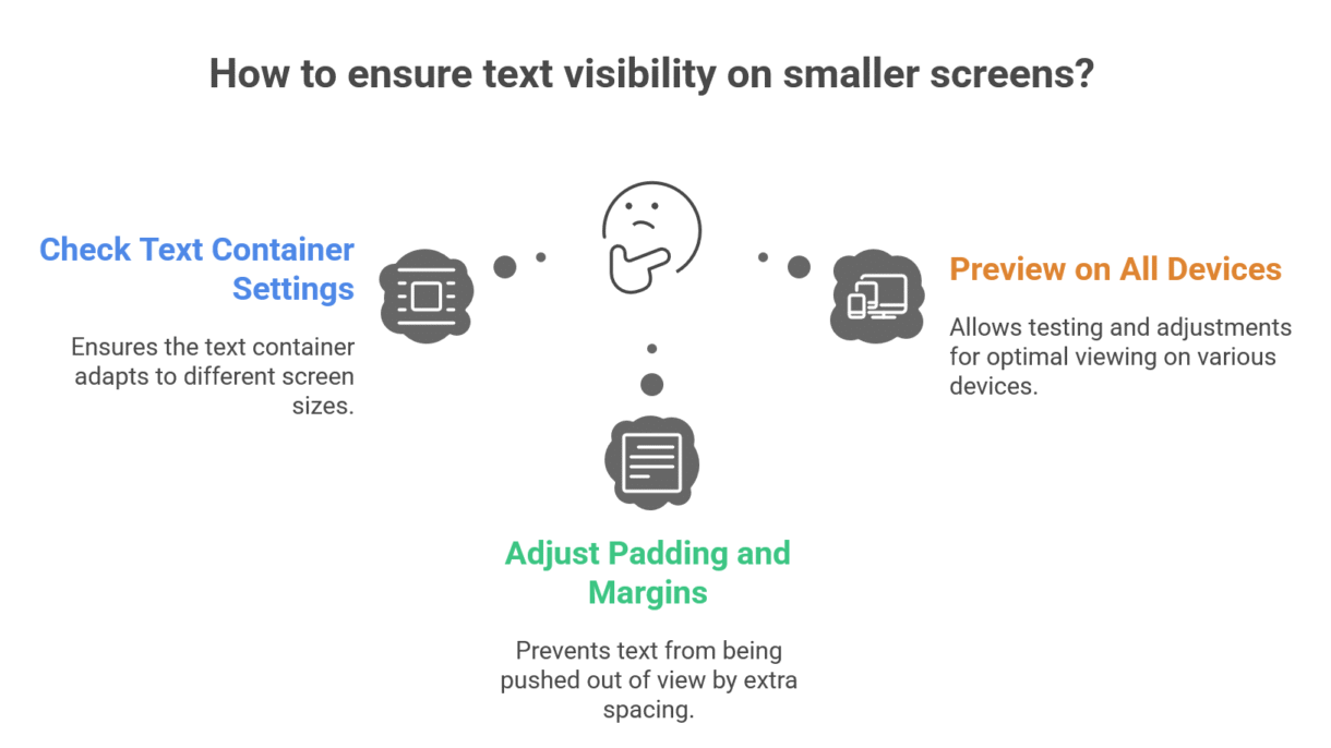
Check your text container settings – Make sure they are set to stretch or adjust automatically on smaller screens.
Adjust padding and margins – Sometimes your text is technically inside the container, but extra spacing pushes it out of view.
Preview on all devices – Wix Studio allows you to preview in desktop, tablet, and mobile mode. Don’t skip this step!
A small adjustment here and there can make a huge difference in how professional and readable your website looks. Remember, mobile visitors are often the majority of your audience—don’t let cut-off text ruin their experience!
If you want your Wix Studio website to look perfect across all devices without the guesswork, I can help you optimize it quickly and efficiently. Let’s make sure your content looks as good on mobile as it does on desktop.