You spent hours developing your design on desktop. However, on mobile, everything slides out of place. 😩
Even in Wix Studio, alignment difficulties can arise and destroy the clean, professional appearance.

Problem:
Wix Studio has excellent responsive control, but if you don’t correctly configure your layouts, desktop and mobile views may act differently. Buttons float, text boxes stretch, and portions become unbalanced. This frequently occurs when elements are not nested within flexible containers or when fixed placement is utilized excessively.
Sollution:
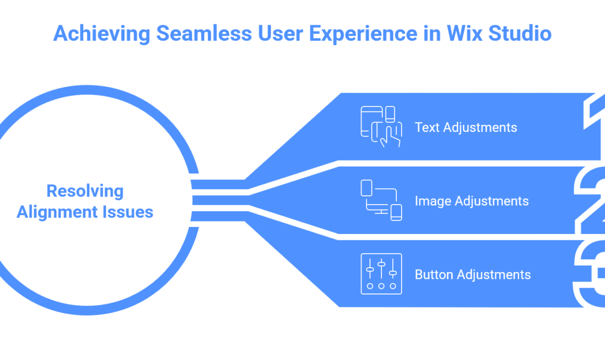
Here’s how to fix alignment issues in Wix Studio like a pro:
- Use Stack, Cell, and Repeater – Always structure your design with responsive containers. They automatically adjust spacing across breakpoints.
- Check Each Breakpoint – Wix Studio allows custom views for desktop, tablet, and mobile. Adjust padding, margins, and alignment for each one.
- Avoid Absolute Positioning – Keep elements within the flow of the layout instead of dragging freely — it ensures they stay aligned across devices.
- Remove unwanted space or margin – Distribute space evenly, align items vertically or horizontally, and maintain balance easily.
- Preview Responsiveness – Before publishing, preview each screen size to make sure everything stays consistent.
If your Wix Studio project looks great on desktop but messy on mobile, I can help you fix it fast.
Let’s make your site responsive, balanced, and truly professional across every screen.